1. Introduction
1. Introduction
Problem
Problem Statement
Problem
Problem
Problem Statement
"Switching between Microsoft Teams and RingCentral app and copy-pasting the number to place a call a time waste for my team"
- RingCentral customer who collaborates in Microsoft Teams
Solution
Solution
Solution
Solution
Solution
A RingCentral Integration for Microsoft Teams that provides a faster access to the Phone, Video and Schedule from right within Microsoft Teams, improving the efficiency of RingCentral’s customers.
A RingCentral Integration for Microsoft Teams that provides a faster access to the Phone, Video and Schedule from right within Microsoft Teams, improving the efficiency of RingCentral’s customers.
My Role
My Role
My Role
My Role
My Role
I was in charge of the research & discovery, brainstorming, and interaction design of this project.
I maintained a strong collaborative relationship with the Product Manager for feedbacks and the final decisions and circled back with the developers to ensure implementation would meet the deadlines. Finally, I worked with a visual designer, Alice Zhang, to finesse the designs and hand-off to the developers.
Team size: 9 - Product Manager | Product Owner | Developers team | Product designer (me)
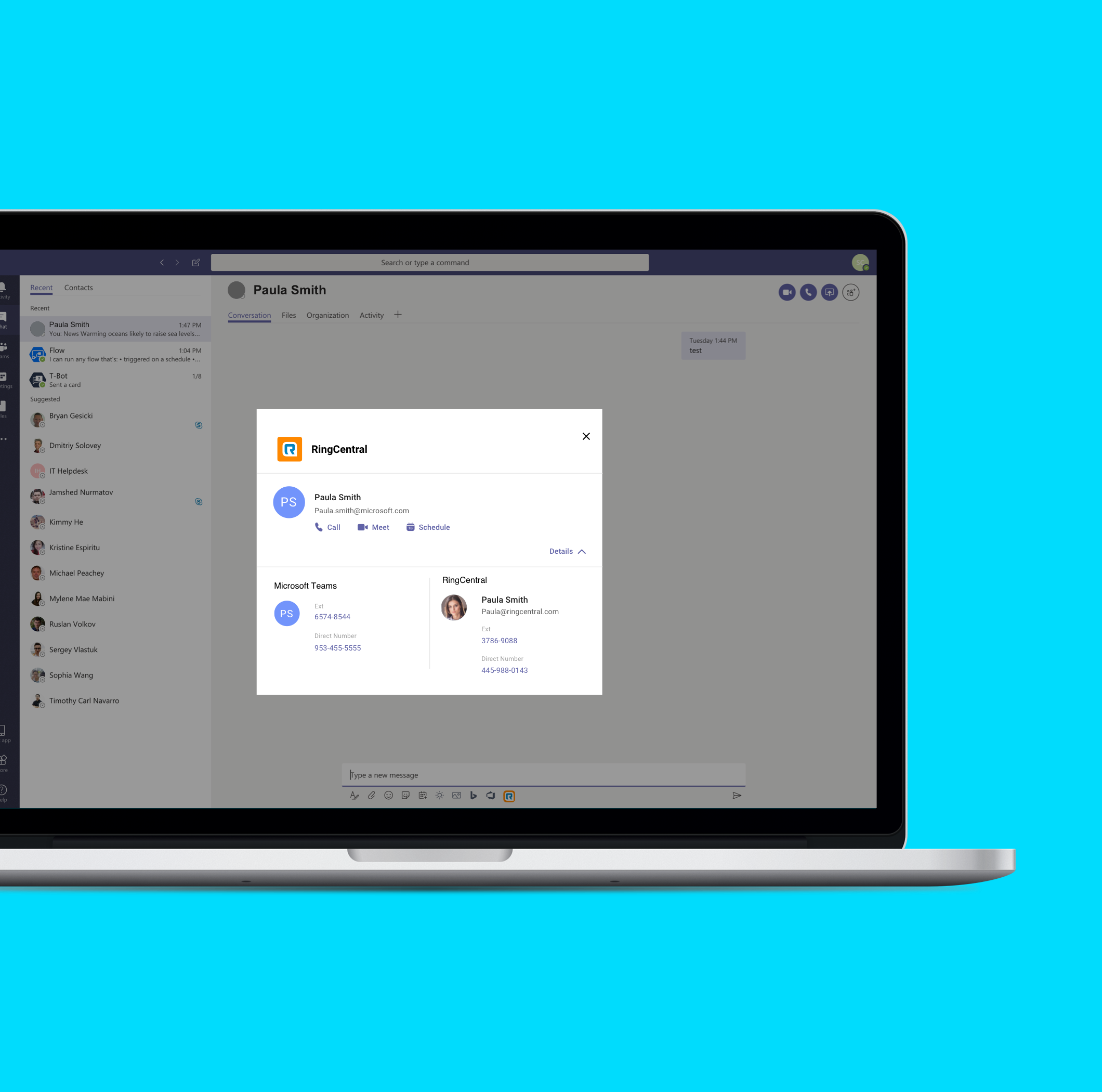
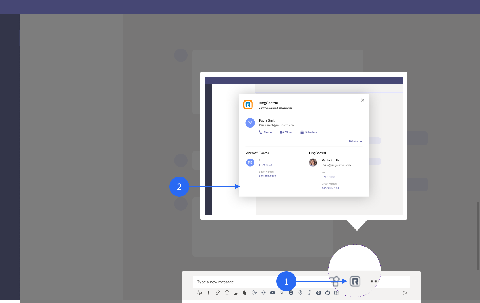
Final Design
Final Design
Final Design
Final Design
Final Design
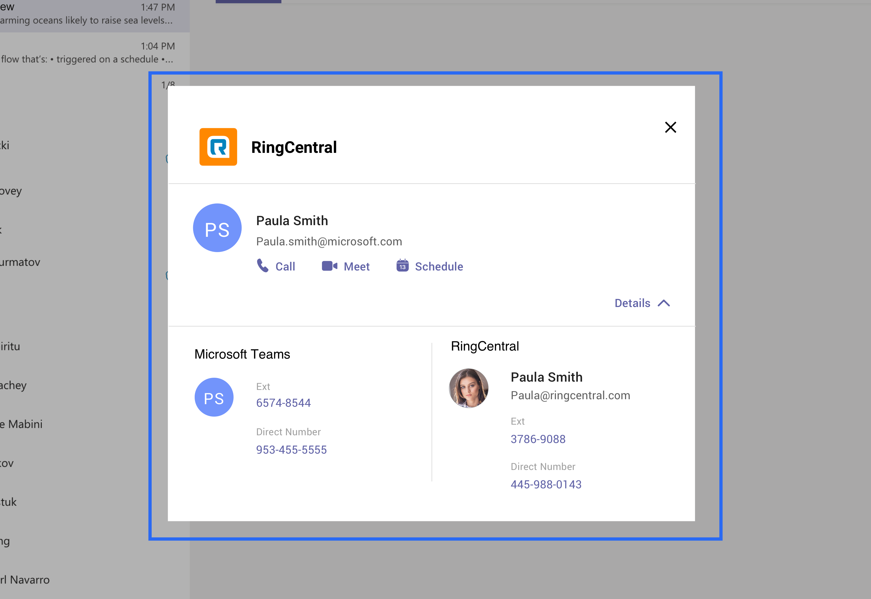
User journey from the launch icon to the profile dialog.
Impact
Impact
Impact
Impact
Impact
Users increased from 800 to 1600.
Release date : Feb 20, 2020
2. Design Phase 1 - Launch Icon: 1-click access to RingCentral features
2. Design Phase 1 - Launch Icon: 1-click access to RingCentral features
2. Design Phase 1 - Launch Icon: 1-click access to RingCentral features
Challenge
Challenge
Challenge
Challenge
Challenge
When clicked, the user would instantly see a dialog with 1-click actions to call, meet or schedule meeting with the person they are chatting with.
Competitive Analysis
Competitive Analysis
Competitive Analysis
Competitive Analysis
Competitive Analysis
Checked out apps like Zoom, Github and Bing for their flows within Microsoft Teams.
Inspirations & Conclusions
Inspirations & Conclusions
Inspirations & Conclusions
Inspirations & Conclusions
Inspirations & Conclusions
- Apps(integrations) follow a standard user flow when installed from the app-store
- All integrations are launched from the bottom of Microsoft Teams, below the text bar
- Each app follows one of two user flows from the launch icon
- Customized dialog (like Github)
- A drop-up (like Wiki)
Initial Design Approaches
Initial Design Approaches
Initial Design Approaches
Initial Design Approaches
Initial Design Approaches
Based on the findings from competitive analysis, I came up with 4 approaches for this challenge. Based on the this analysis, our first choice was the 4th approach – Drop-up then dialog approach, however, due to the development overhead we chose the 2nd approach - Dialog approach as it was scalable despite the con.
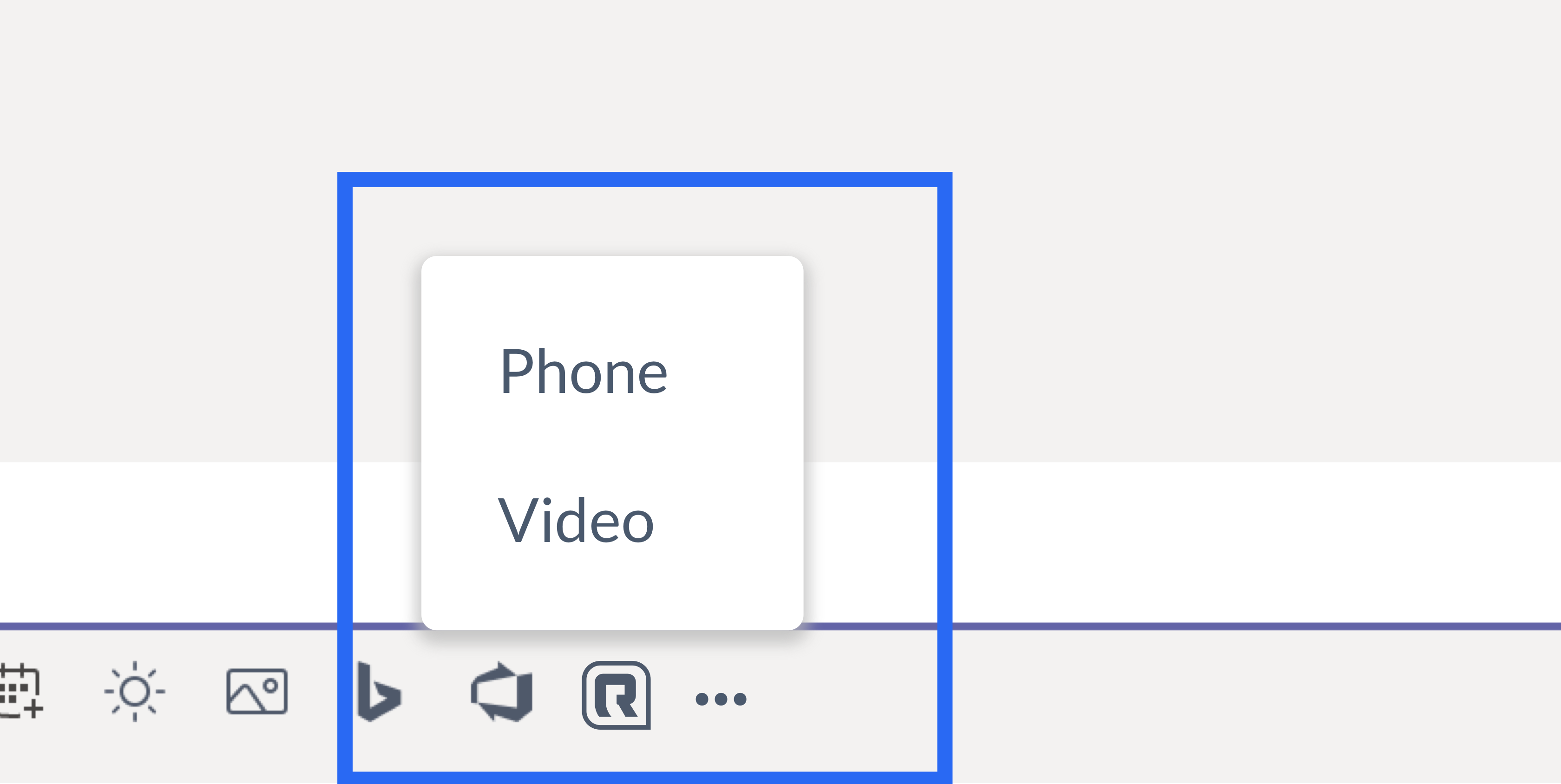
Approach #1: 2 separate icons (one for "Phone" and one for "Video")
Here there would be 2 icons in the list of icons below the message bar. The "Phone" icon would launch the phone capabilities and the "Video" would launch the video capabilities.
Pros:
- A great segregation between the two functionalities which provides an easier reach to both of them
Cons:
- Developers would have to develop 2 integrations instead of one
- Schedule would need to be clubbed under the "Video", hence not scalable
- 2 icons are harder to brand, especially with the UI theme that Microsoft Teams would let us use, making them easier to blend in with other integrations
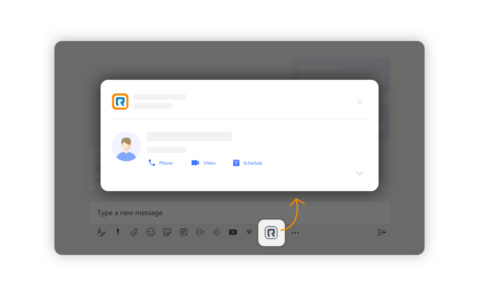
Approach #2: Dialog
Like Github, we would have 1 icon in the integration list, which would open a dialog. This pop-up can have a customizable design which need not follow Microsoft Teams UI.
Pros:
Scalable design, to include more functionalities/details
Cons:
- The integration doesn’t necessarily need to obstruct the user flow to shift his focus to the dialog box
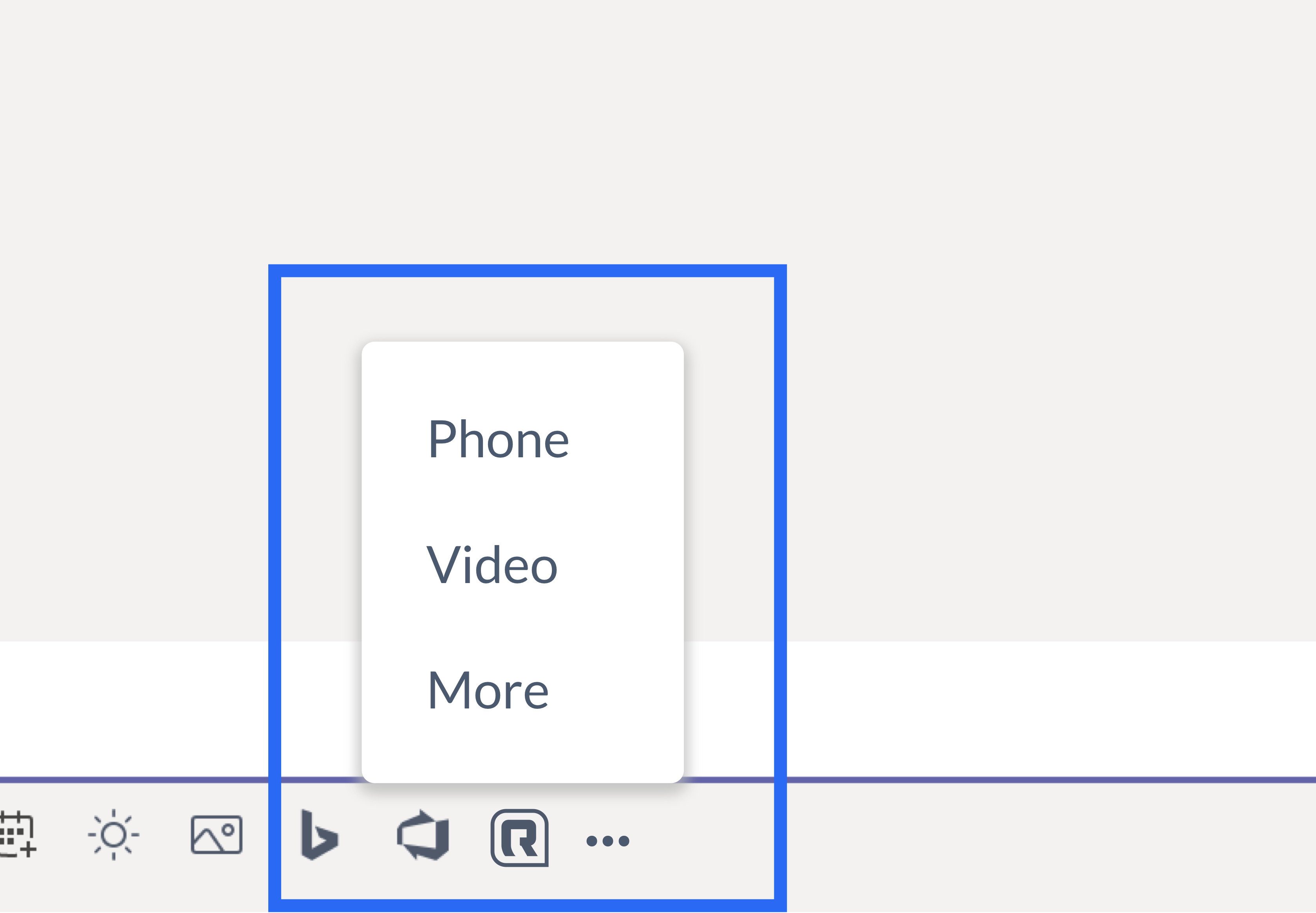
Approach #3: Drop-up
A drop-up that would contain the 3 main functionalities and would provide a 1-click interaction to each of them
Pros:
- This interaction provides the functionality to the place the user is currently focusing on, hence not shifting the user’s focus.
Cons:
- It is not scalable, even while working through this approach it was difficult to fit the non-default phone numbers in the drop-up
Approach #4: Drop-up then dialog approach
Here there would be 2 icons in the list of icons below the message bar. The "Phone" icon would launch the phone capabilities and the "Video" would launch the video capabilities.
Pros:
It lets the user get to the calling and meet functionalities immediately which use defaults
It is scalable
Cons:
- It would potentially double the development time as it is implementing both dialog and drop-up
3. Design Phase 2 - Profile Dialog: Lets the user contact another person efficiently
Challenge
Challenge
Challenge
Challenge
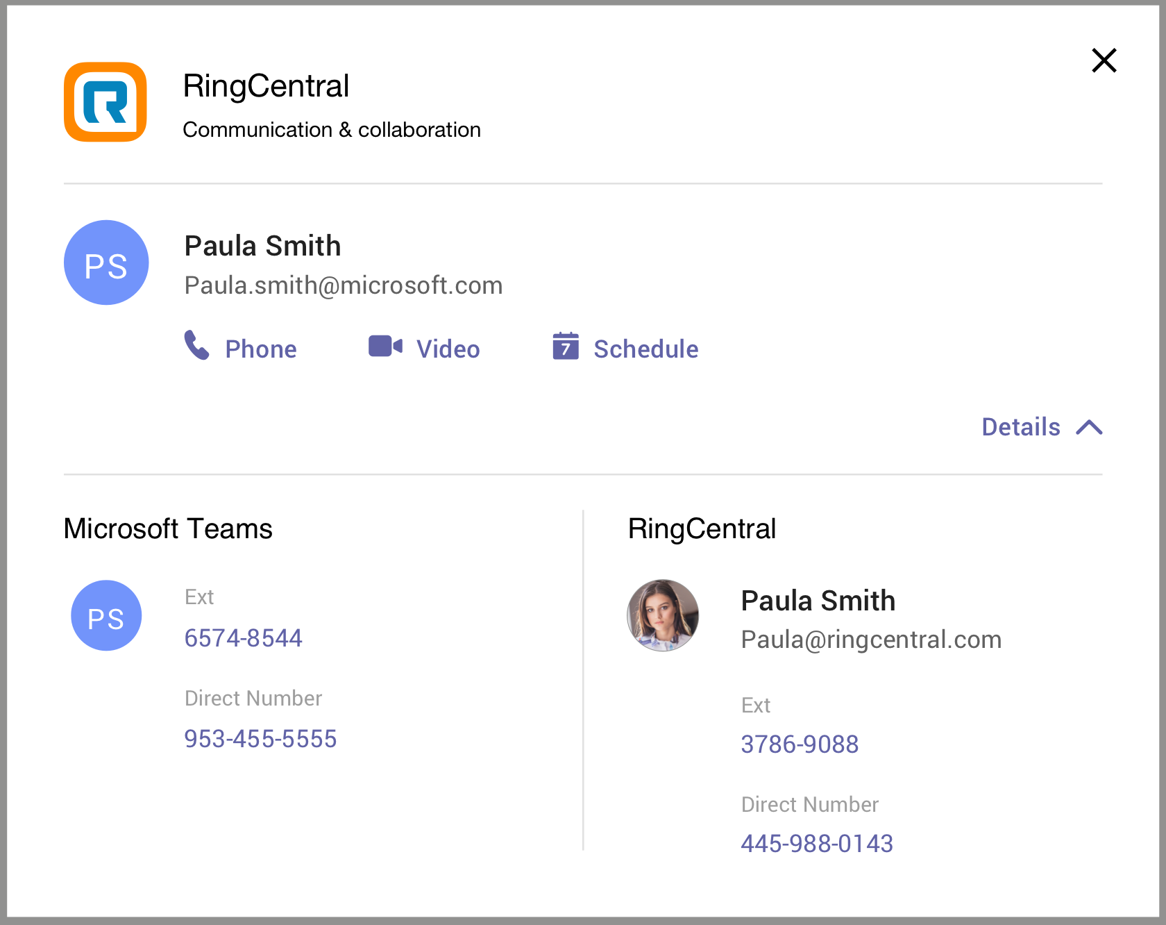
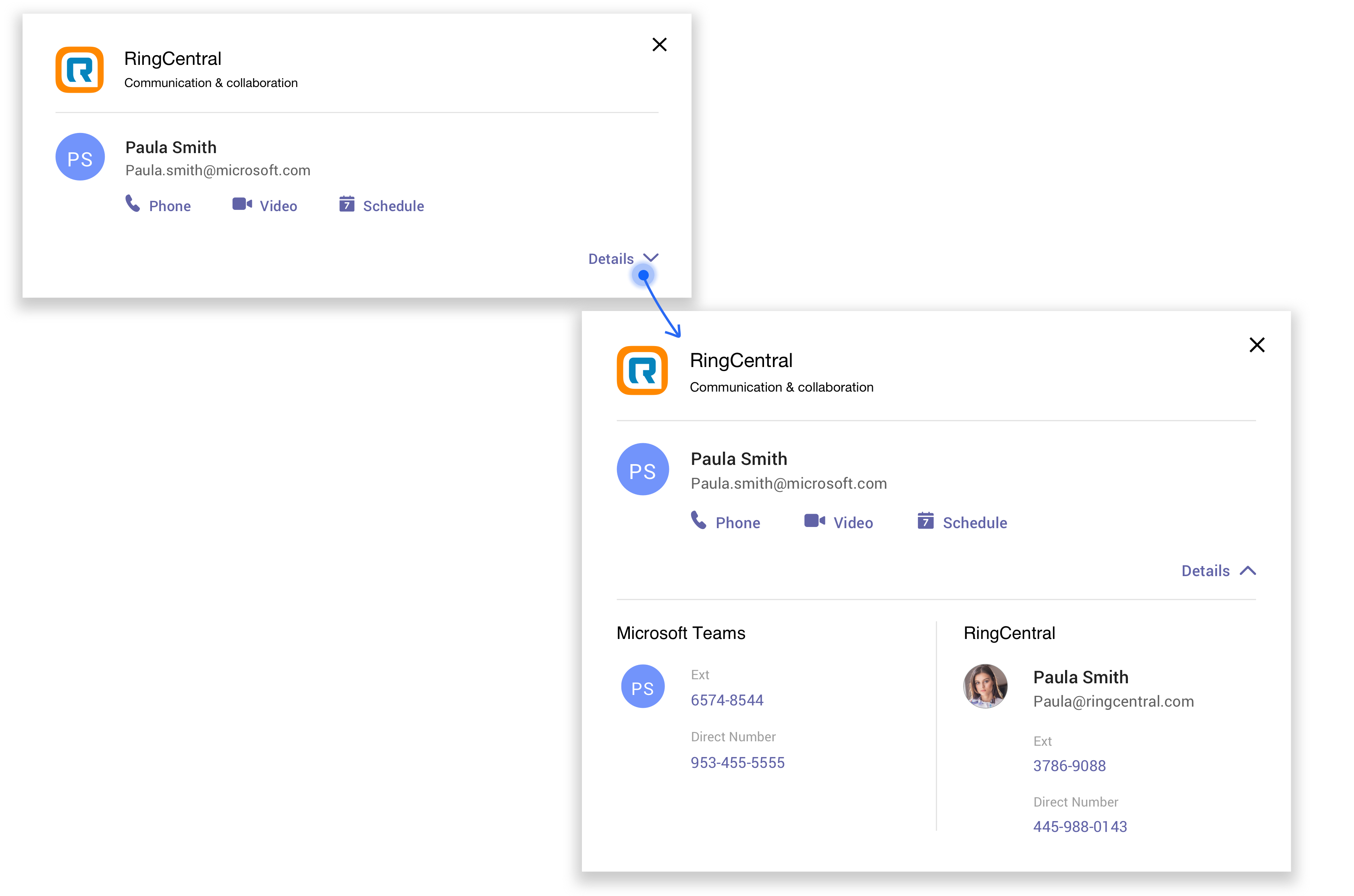
Design a dialog with a contact’s Microsoft and RingCentral account details in a non-overwhelming manner
Initial Design Approaches
Initial Design Approaches
Initial Design Approaches
Initial Design Approaches
Priority-wise features -
Priority 1 features that need to be included -
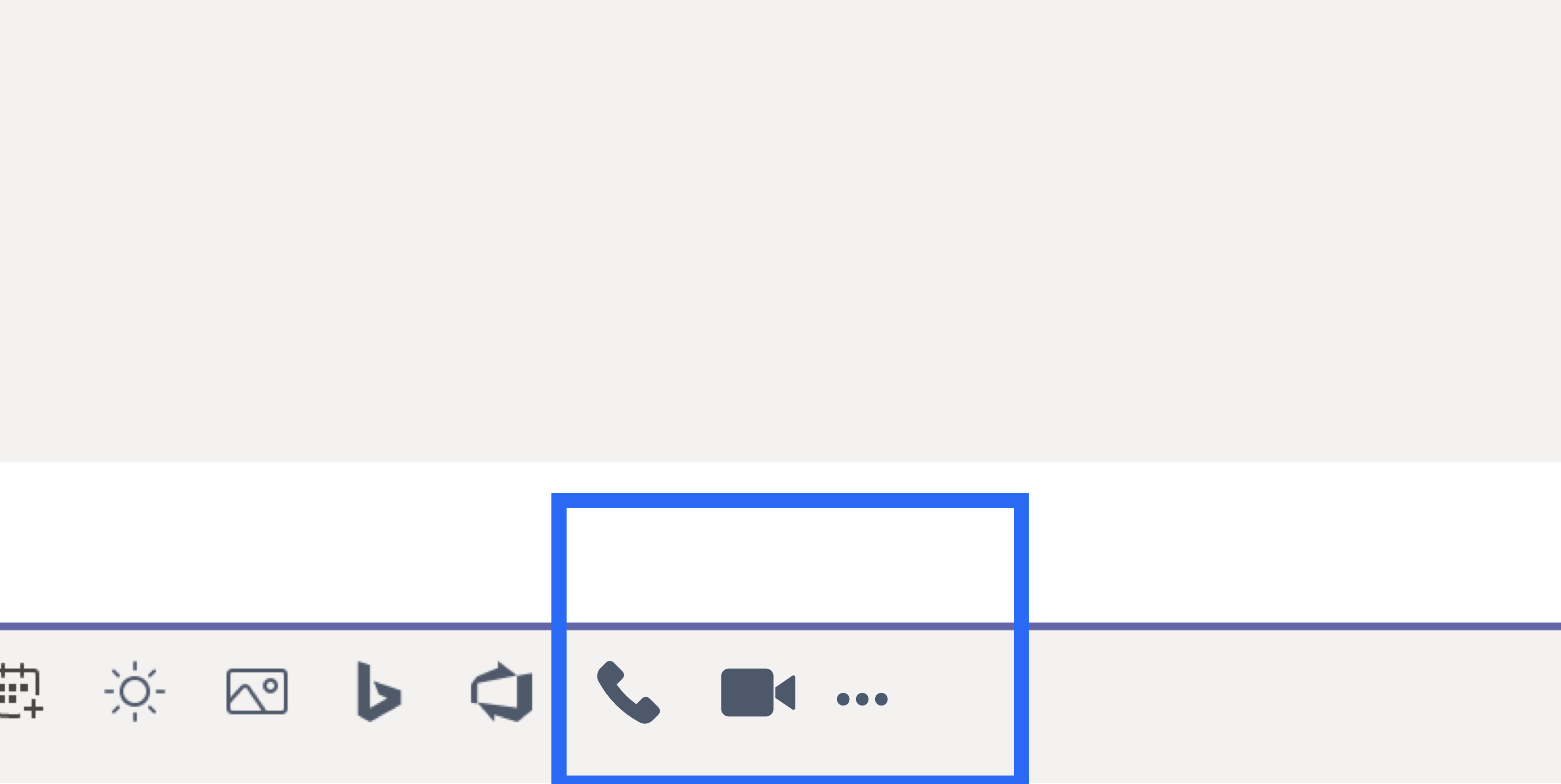
- “Phone" function capabilities – A CTA which launches the RingCentral Phone app and dials the default number of the contact
- “Video" function capabilities – A CTA which launches the RingCentral Video app and starts a video meeting with the contact.
- “Schedule" function capabilities - A CTA to schedule a meeting on to the Microsoft calendar with the contact with the ability to add more contacts.
Priority 2 features that need to be included –
- More "Phone" details – A list of the contact's other direct lines/phone numbers (from both RingCentral and Microsoft Teams accounts)
Iteration #1: Structuring the dialog based on priority
With the features and their priority in mind, I looked at multiple companies out there like Google, Microsoft and others.
Keeping this structure in mind, I created the first iteration of the dialog. Here, I spoke to the developers to understand what the content could be and how much content is there.;
As per the developers, there would be
- Contact’s name
- The Phone, Video and schedule buttons
- Contact’s Microsoft phone numbers
- Contact’s RingCentral phone numbers
A couple basic low fidelities later, I designed the this dialog. I kept the
- contact’s primary information and the 3 main buttons on the top.
- contact’s secondary information on the bottom in two columns.
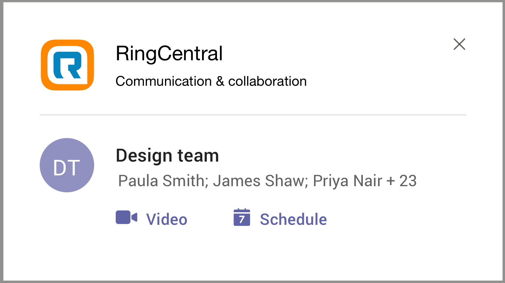
For a group, the layout differed as there was lesser information to display and only 2 actions –
- Conference call
- Schedule
Iteration #2: Refining the dialog to 2 dialogs
I user-tested the iteration #1 with a Senior Designer and a Product Manager. Feedback was overall positive with a few comments
- “It’s a little text heavy” – designer’s concern
- “Love the layout, however, is there a way to know which is the default number that would be called?” – PM’s concern
Both were valid concerns, and taking their feedback into consideration, I re-worded their concerns into design challenges –
- Is there a need to provide the Priority 2 information to the user as soon as the user opens the dialog?
- Is there a visual UI indicator I can add to differentiate the default number?
Based on the user-test comments, I took 2 design decisions –
- Progressive reveal of information - through an expand and collapse of the dialog
- Mention the default number next to “Call” text
Here, the UI for the group was not affected.
RingCentral's Marketing Microsoft Integrations