Introduction
Problem
Problem Statement
Problem Statement
Microsoft Teams is one of the most widely used platforms for Inter-Office Communications by RingCentral Clients. The user usually has to use the RingCentral apps in conjunction with Microsoft Teams and needs to keep switching between the two apps. Changing context frequently causes a reduction in their efficiency.
"Switching from Microsoft Teams to RingCentral app and copy-pasting the number to place a call a time waste for my team"
- RingCentral customer who lives and breathes in Microsoft Teams
Solution
Solution
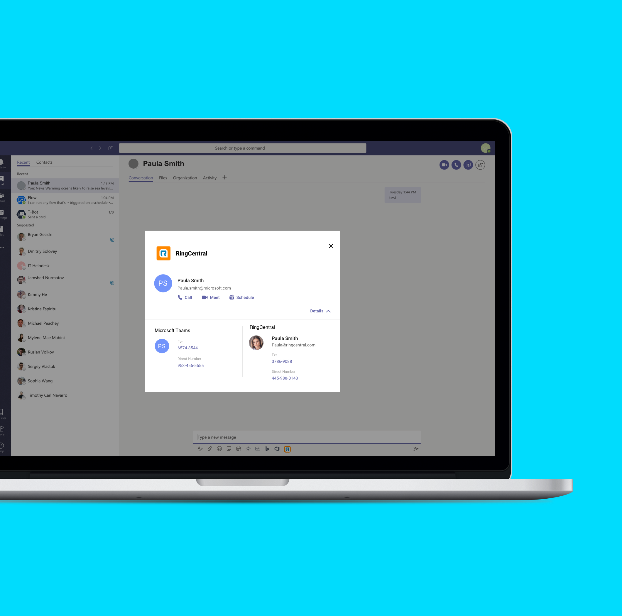
A RingCentral Integration for Microsoft Teams that provides a faster access to the Phone, Video and Schedule from right within Microsoft Teams, improving the efficiency of RingCentral’s customers.
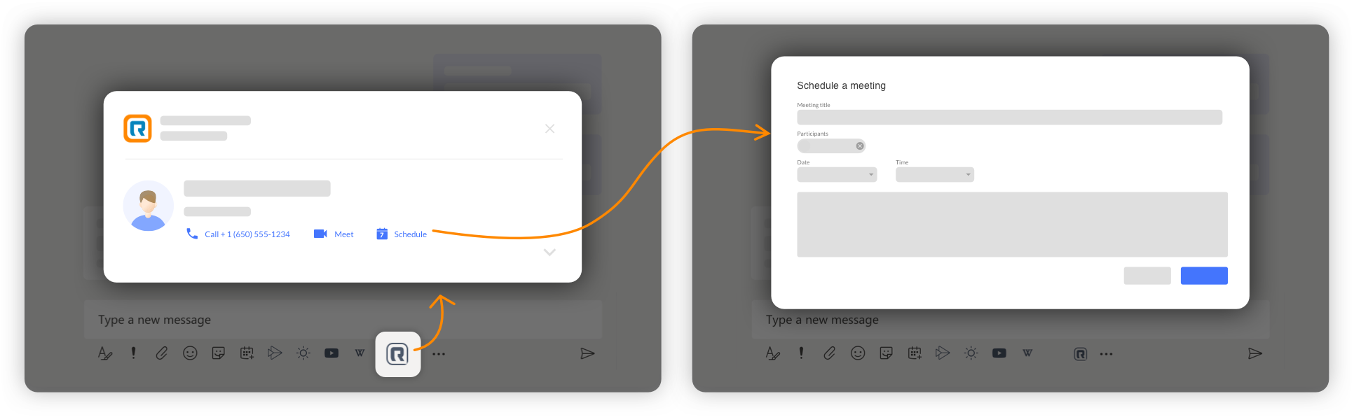
User journey from the launch icon to the profile dialog to the schedule dialog:
My Role
My Role
I was in-charge of the research & discovery, brainstorming and interaction design of this project. Along with that I maintained a strong collaborative relationship with the Product Manager, Priya Sukumar, for feedbacks and the final decisions and with the developers to address their concerns. Finally, I worked with a visual designer, Alice Zhang, to finesse the designs and hand-off to the developers.
A 3-step Project
1) Launch Icon
When clicked, the user would instantly see a dialog with 1-click actions to call, meet or schedule meeting with the person they are chatting with.
Challenge:
Establish best interaction of the integration’s launch point for the customers
Pros:
- Focussed dialog: Allows the user to take end-to-end recurrence decisions in one place, retaining his focus.
- Recurrence summary: Provides a summary of the recurrence frequency in the end, providing a context to the user.
Competitive analysis:
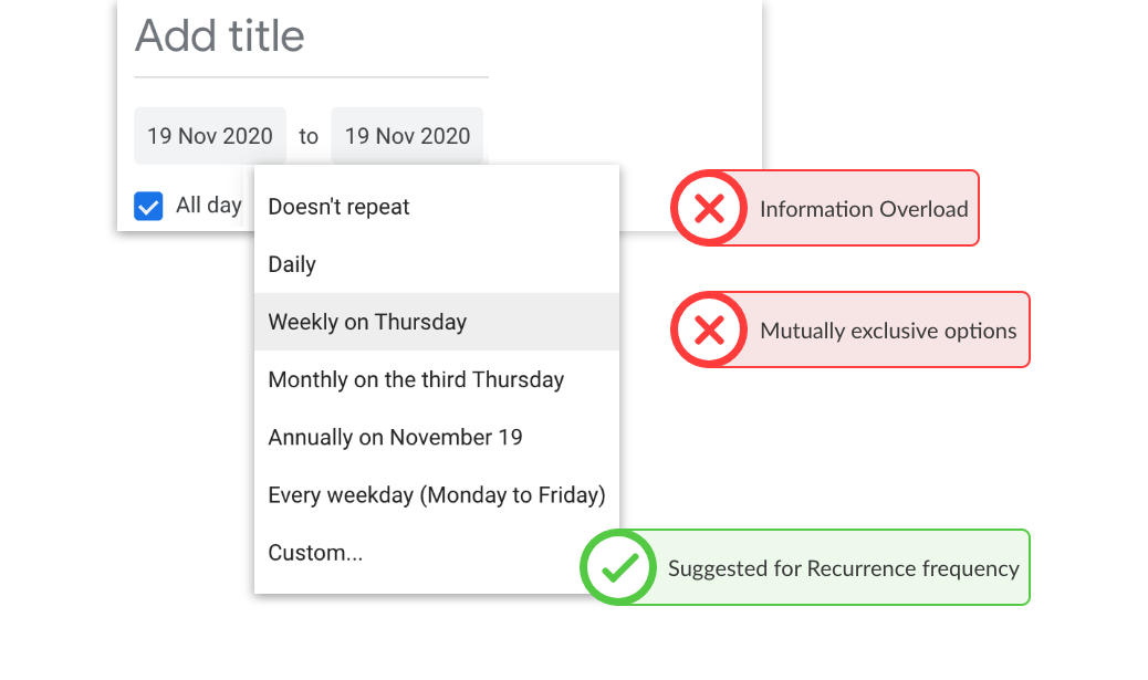
- Unfamiliar dialog interaction: Selecting the recurring meetings button opens a dialog box without graying out the background, defeating the “pay attention here” purpose of a dialog box.
- Unfamiliar dialog location: The dialog open in the center top of the page, away from where the user is currently paying attention.
- Information Overload: The only text in the dialog are 8 different dropdown in the small screen real-estate. This will overwhelm the user and lead to errors.
Inspirations and conclusions from the competitors:
- Apps(integrations) follow a standard user flow when installed from the app-store.
- All integrations are launched from the bottom of Microsoft Teams, below the text bar.
- Each app follows one of two user flows from the launch icon
- Customized dialog (like Github)
- A drop-up (like Wiki)
Google Calendar
Google Calendar is used in many professional as well as personal settings. It allows for great integrations with 3rd party apps as well as other Google apps.
Pros:
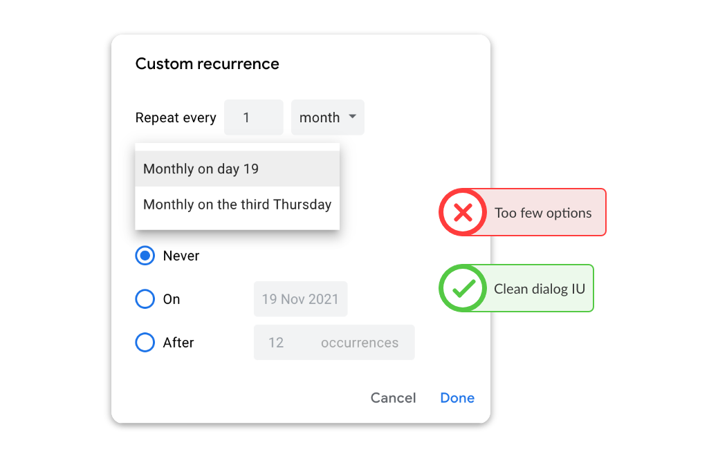
- Clean dialog UI: The custom dialog looks clean, with few options to pick from.
- Suggested recurrence frequencies: Google calendar gives upto 8 suggested recurrence frequencies along with a custom option in an initial dropdown.
Cons:
- Too few options: When selecting recurrence from the dropdown or the custom dialog, there are few options, which can give a sense of “incomplete”.
- Mutually exclusive options: The options in the dropdown are not the same as the ones provided in the custom dialog. This might lead to confusion and the user might end up spending time finding the desired option, which is not an efficient behavior.
Inspirations and Conclusions
Insprirations:
- Outlook’s recurrence summary, although not perfect.
- Google’s dialog box UI was clean and not overwhelming.
Conclusion:
- Outlook covered all the use-cases in one place, providing a complete view for all the use-cases.
- The process of scheduling recurring meetings has a lot of use-cases and might need extra attention for edge cases such as setting up a sem-checkin meetings last Thursday of every semester.
Initial Design Approach
Learning from the competitive analysis, observing the interactions offered by Microsoft and Google and keeping a professor's persona in mind, I began the design with 2 different approaches -
Approach #1 "Dialog interaction"
A similarity that came to light from the competitive analysis of Microsoft Outlook and Google Calendar was that they both offered a dialog for the recurrence functionality.
A similarity that came to light from the competitive analysis of Microsoft Outlook and Google Calendar was that they both offered a dialog for the recurrence functionality.

Approach #2 "In-line interaction"
Approach #2 "In-line interaction"
A dialog is usually used to either obstruct an user's flow to ask for a confirmation or direct the user's attention to a specific task, however I wanted to counter that with an inline approach, as this task didn't need to obstruct user's flow or immediately pull and keep his attention.
Concept Testing
Iteration 1
A brief user-test with 2 designers and the PM, we decided to go ahead with the "in-line interaction approach".
A brief user-test with 2 designers and the PM, we decided to go ahead with the "in-line interaction approach".
3/3 believed that a dialog would be more cognitively overwhelming than an inline approach.
With a decision between - low cognitive load versus a more focused approach, we decided that cognitive load holds higher priority than to isolate the functionality.
A professor doesn't need the form to be complicated.
- A Product Manager
A professor doesn't need the form to be complicated.
- A Product Manager
I like the dialog. It provides a focussed view for the complex decisions and dropdown - but it does have the potential to get overwhelming.
- A Product Manager
Iterations
Iteration 1
After deciding to go with Approach #2, the next step was to organize the use-cases. This was key to achieving an accurate direction for the overall design of the functionality.
Some key aspects to investigate for the first iteration
- What would be the recurrence frequency? - Final options are 'Daily', 'Weekly' and 'Monthly'.
- How does the recurrence end? Final options are 'Specific date', 'Specific number of occurrences' or 'Always recurring'.
- Would there be a need to repeat the meeting multiple times in a week or month?
- If monthly, how to manage specific occurrences, like last Friday of every 2 months.
Outlook served as great point to start. Listing out all the the use-cases first and then cross-referencing them with Google calendar gave a complete list of use-cases to cover.
Answers to all the above questions provided a wholistic view of every use-case that could be encountered.
Iteration 2 covered all the dropdowns that were required and how they can be placed in an intuitive manner.
Iteration 2
The last iteration was to improve the design and make it more intuitive.
The copy of the titles and the layout of the dropdowns were the main focus of this iteration. In the end, we came up titles that sounded like a conversation -
- Repeats every
- Until
In the end, the way we tackled "Cognitive Overload" was progressive reveal of dropdowns.
- Step 1 - Do you need recurrence ? - if yes, check yes!
- Step 2 - Ok, so when does it repeat and until when?
- Step 3 - With your choice of recurrence (monthly, weekly and daily) let's help you pick the specific details.
The progressive reveal gently guides the user to the required fields, which reduces cognitive overload.
Also, this was the phase where I worked with Alice, our visual designer, to finesse the visual design and help wrap up the project.
Iteration 3
Recurrence summary was an interesting piece of this project.
Aspects I kept in mind -
- We needed a template that covered all the use cases
- The template needed to be generic enough so that it was easy to implement with very few variables
- The language needed to be easy to read and conversational
Validations!
Fast forward 1.5 years to 2020 November
Microsoft Outlook released a "New look" for the product. While setting up a recurring meeting, I came across their new recurrence summary.
2 observations -
- There was a stark difference between the old and the new.
- The new was surprisingly similar to what I had come up with!
It's a good feeling to see such instant validations to designs from such big brands.